
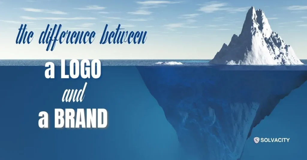
Several times, a business may have an iconic logo with poor brand identity. A memorable logo and brand identity are connected, but actually both are dissimilar elements. A good logo provides a point of reference, a symbol that people can become familiar with and recognize. The brand identity reflects a bigger system of more and less tangible elements that define what the business looks, sounds, and feels like in all its customer interactions. Understanding the difference matters to SolvaCity. Why it’s important for us is that customers sometimes spend a lot of money on a logo, while neglecting the rest of the branding package. And we know that’s what makes the brand memorable.
A Logo Is One Part of the Picture
A logo is a graphic, wordmark, or combination of both that signifies a business. It could be on a website, social media profile, product packaging, business card, storefront, or ad. Its purpose is to be recognizable. That does not diminish the importance of the logo.
A successful logo becomes a part of a business that is instantly recognizable. Adobe describes a logo as an icon of a brand, but other factors like colors, typeface, images, etc. form the broader visual identity. It doesn’t matter that a logo alone cannot tell you everything about a company; it must have context. Customers might see the brand logo, but the way it makes them feel is also influenced by everything else that a company does.
Brand Identity Goes Much Further
Your logo can be a part of your brand identity, or it can be a part of it. Brand identity is what the business purposely uses to communicate to the public: colors, types, photos & drawings, styles of drawings, logo, language & tone of voice, and how you use it. This whole system is why logo vs brand identity is such an important difference. The logo is one piece of the identity.
Consider a fresh, modern blue logo for a business. What information does it give to consumers about being innovative, reliable, cheap, premium, accessible, and traditional? All of that is based on the real identity of the company, which is conveyed through what they experience and the ‘whole’ identity.
Consistency Changes Everything
A consistent identity makes more sense when some signals the customer is already familiar with reappear. The same colors and style may be used on the website and social media. The same typeface may be used in marketing material. The same kind of imagery may be used throughout the range of marketing material. The same language may be used.
Adobe even has a visual branding style and guidance that essentially builds the identification of the brand. This is where you can learn and benefit from going above and beyond choosing pretty colors and nice fonts. Visual style elements should be collaborative. A business should know how its visual style elements will be implemented, which colors are a part of that style set, and the visual style to use.
A Logo Should Fit the Identity
A good logo cannot stand on its own. Its form, font, color, and overall character should complement the character the business seeks to portray. A serious and professional company may require a different appearance to a children’s clothing specialist. A new technology start-up might wish to retain a flexible and contemporary identity, whereas a more traditional and historical business might prefer a more established character.
This doesn’t mean that a logo has to spell out the business in literal terms. It just needs to be “appropriate and flexible enough to be part of a larger identity system”. Adobe’s logo guidelines advise considering the logo as a “peripheral component of the whole visual landscape”.
Recognition Comes From More Than One Element
People often don’t know a company simply because they see its logo. Instead, they might recognize the overall color scheme, design, packaging, the language used, or typefaces employed. Bit by bit, those little things add up, and so visual identity is what makes for an easier-to-recognize business.
A shared visual identity gives consumers more opportunities to associate different encounters with the same company. In addition, WIPO clarifies, “Trademarks, such as figures, logos, and other devices, can be used to create a visual image that separates the business from others and protects consumers from confusion.” That doesn’t mean that every visual element needs to be trademarked.
A Brand has a Voice Too
Visual logo design is only one aspect of a brand’s identity. The tone of voice in which a business speaks makes a difference too. Think of two companies that have almost identical-looking logos. One employs a warm, straightforward tone with accessible descriptions; the other adopts a more formal tone and uses specialist terms.
This is why business branding must look and speak. Every business requires a distinctive personality that can be reflected on the website, social media messages, advertisements, emails, and customer service. Not trying to make all messages sound the same. Rather, make all messages sound the same.
Random Content Can Break the Connection
A business might have a nice logo and business cards but have inconsistent branding. The social media posts might feature an excessively warm color palette in one, while the other uses contrast-rich fonts and a different visual style on the website. The logo is there but not a brand image.
That’s why having a consistent framework for what a business posts and how it is visualized is important. Continual visual and messaging patterns allow customers to get to know a business in the way they are used to. Without that consistency, even a great logo will have difficulty establishing it.
Or the problem is even more obvious when businesses publish without any planning. Doing a planned and regular sharing of content on social media can help the same visual identity, tone of voice, and personality be established and reinforced across the various social media channels. Randomly producing content might create some activity, but it doesn’t create a brand. The brand is only established if it is recognized because of the content, not just the image.
The Identity Should Work Everywhere
Practical identities can’t be too rigid. You might use your logo on a website header, your social media account, your business card, product label, billboard, or as a huge sign outside your building. As colors and typefaces need to function in web and print scenarios, branding identity design needs to take real-world applications into account right from the start. It should offer enough structure to maintain consistency, yet enable the designer to pull together different collateral without everything looking the same. Look at how Adobe has introduced its identity to make this work.
Build the System, Not Just the Symbol
A logo is just one piece of the puzzle, but it is not the whole picture. The logo is the mark of the business. The wider identity brands that logo and gives it context and consistency. A strong identity and logo should complement each other everywhere your customers come into contact with your company. Recognition comes from the logo, but color, type, imagery, messaging, and experience build the whole product.
If your company is growing or renewing its visual communication, solvacity.com can help it with professional logo design services to build a strong identity system. Having a well-designed business branding strategy can provide the company with a more cohesive and uniform brand presence as it evolves.